
One AI Visibility Score Hides Three Stories
Real tracked-account data shows the same brand fighting three different competitive battles depending on which AI engine you check.
Aug 2026 · ~10 min readI split one brand’s tracked data by engine instead of pooling it, expecting minor variance at most. What came back was three engines telling three different stories, and that’s before even getting to the competitors: depending on which metric you trust, this brand’s strongest channel is either the one where it shows up most often, or the one where it wins the largest share of the conversation against its competitors, and those turn out not to be the same channel.
The blended number every tool defaults to, one score averaged across every engine, would have reported “strong visibility” and left it there. It’s not wrong. It’s just hiding which channel that strength actually comes from, and hiding that a second, equally real metric points somewhere else entirely.
The data: one brand, three engines
Same tracked brand, same set of prompts, split by engine instead of pooled. Four months of data, US market, a clean consumer haircare brand.
| Engine | Visibility | Share of voice | Avg. position |
|---|---|---|---|
| Google AI Overview | 20.43% | 27.42% | 2.8 |
| ChatGPT | 15.25% | 33.73% | 1.4 |
| Perplexity | 15.05% | 56.65% | 1.3 |
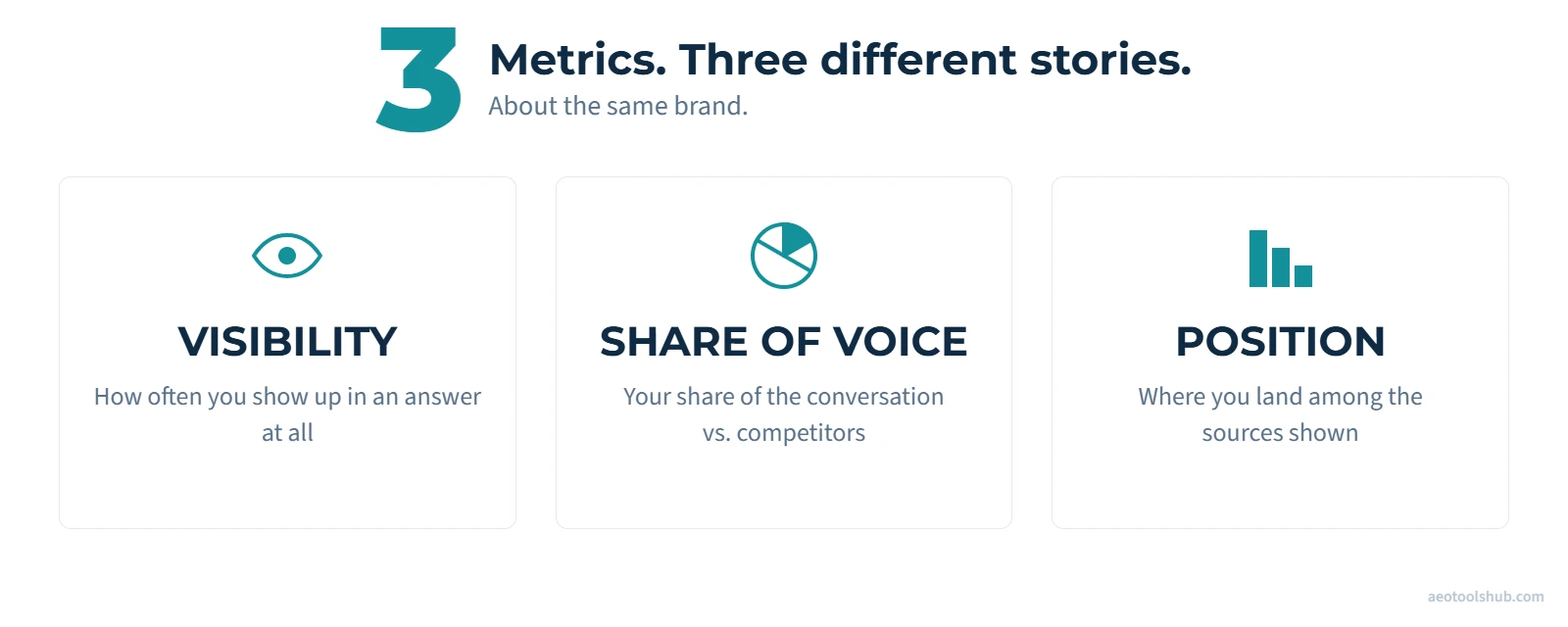
Read across the row and the three numbers don’t agree with each other, and that disagreement is the actual finding. Visibility, the number I trust most for a first read (see my guide to which AI visibility metric to trust for why), says Google AI Overview is this brand’s strongest channel: 20.43% of tracked prompts surface it there, clearly ahead of ChatGPT and Perplexity, which sit close together around 15%. Share of voice and average position tell close to the opposite story: on Perplexity, this brand’s share of the conversation is more than double what it is on Google AI Overview, and it typically lands close to first place rather than third or fourth. Neither reading is wrong. Visibility answers “how often do you show up at all”; share of voice answers “how much of the conversation, relative to your competitors, is yours”; position answers “how prominently you’re featured on the occasions you do show up.” A single blended score, or a single metric read on its own, reports one of these stories and quietly drops the other.
The competitive order flips too
The more interesting confirmation is what happens to the competitive set, not just the tracked brand. Six competitors, same period, same channel split. This table shows both visibility and share of voice for the same fixed competitor list, one engine at a time: the competitor list doesn’t change from row to row, only the engine does, so the comparison is apples-to-apples in a way the single blended number above wasn’t.
| Competitor type | Google AI Overview | ChatGPT | Perplexity | |||
|---|---|---|---|---|---|---|
| Visibility | SoV | Visibility | SoV | Visibility | SoV | |
| Premium generalist haircare brand | 23.43% | 18.29% | 13.89% | 11.94% | 3.38% | 4.18% |
| Established clean-formula competitor | 19.35% | 14.58% | 17.82% | 17.16% | 2.97% | 3.75% |
| Wellness-positioned niche brand | 18.91% | 19.44% | 11.89% | 10.61% | 7.42% | 10.67% |
| Age-positive niche competitor | 13.46% | 14.72% | 3.57% | 8.88% | 4.00% | 13.57% |
| Luxury salon-heritage brand | 5.62% | 3.37% | 13.55% | 10.62% | 3.97% | 4.11% |
| Sustainable-ingredient niche brand | 3.54% | 2.18% | 7.86% | 7.06% | 3.84% | 7.06% |
Look at the premium generalist brand in row one: strong on Google AI Overview, respectable on ChatGPT, then barely present on Perplexity at all. Now look at the age-positive niche competitor in row four, close to the opposite shape, weak on ChatGPT, middling on Google AI Overview, comparatively strong on Perplexity. These aren’t small brands with noisy, low-volume data either. The ranking actually reorders depending on which engine you’re looking at, not just the absolute numbers moving up and down together.
If you were only tracking Google AI Overview, you’d conclude the premium generalist brand is the entrenched leader and the niche players barely register. If you were only tracking Perplexity, you’d draw close to the opposite conclusion. Neither view is wrong. Both are incomplete on their own.
There’s a sharper version of this same problem sitting inside the table itself, this time comparing the tracked brand directly against one competitor, the premium generalist brand, on a single engine: Google AI Overview. By visibility, the premium generalist brand actually leads: 23.43% versus this brand’s 20.43%. By share of voice, it’s the other way around: this brand leads, 27.42% versus the premium generalist brand’s 18.29%. Ask “who’s ahead on Google AI Overview” and the answer depends entirely on which of the two metrics you’re reading. Both numbers are correct; they’re just answering different questions, and a report built on only one of them would tell you the opposite story from a report built on the other.
That’s not a contradiction in the data, it’s a difference in what each metric actually counts. Per Peec’s own documentation, visibility counts responses: one response counted once, no matter how many times a brand is named inside it. Share of voice counts mentions: every individual name-check, including more than one within the same response. A brand can show up in fewer distinct responses than a competitor and still end up with more total mentions, if it tends to get named repeatedly within the responses where it does appear, and that’s enough on its own to flip which metric shows it ahead.
Why this happens
The counting mechanism above explains how visibility and share of voice can diverge at all. It doesn’t explain why the gap is so much wider on some engines than others: on Google AI Overview this brand’s share of voice runs about 1.3 times its visibility (27.42% vs 20.43%), but on Perplexity it runs almost four times its visibility (56.65% vs 15.05%). That narrower question I don’t have a confirmed answer for. One plausible thread: Google AI Overview pulls from a broader set of sources per response than the other two engines, a mechanic I’ve covered in the fan-out workbook, which could mean more competitors get named alongside this brand in the same response on Google, spreading mentions thinner without necessarily reducing how often anyone individually shows up. Perplexity and ChatGPT would then be doing the opposite: naming fewer competitors per response, so each mention of this brand counts for a bigger slice of that response’s total. That story fits the data I have, but it’s a hypothesis built after seeing the numbers, not a tested one, and I’d want to see it hold on a second dataset before calling it more than a working theory.
This connects to something I found when I looked at citation intensity by engine in my previous piece on retrieval versus citation. Google AI Overview showed the clearest, if still weak, relationship between a domain’s scale and how hard it gets cited (r=0.33): bigger, more established players get a modest structural edge there. Perplexity showed almost none (r=0.07): size barely predicts anything, and specificity does more of the work.
That pattern lines up with the competitive-order flip above. A large, generalist, long-established brand has more of the kind of scale-driven advantage that helps on an engine that modestly rewards established players. A smaller, more narrowly positioned brand with sharply focused content has comparatively little to lose, and something to gain, on an engine that doesn’t care much about scale in the first place. This is a plausible mechanism, not a proven one. I’m pattern-matching across two related but separate analyses on the same dataset, not running a single test that establishes causation.
There’s a second factor worth being precise about, because my first instinct here was wrong. Perplexity’s citation-first product design attaches a numbered citation to nearly every claim in the response, covered in my Perplexity mechanics guide. I originally assumed that discipline would cut the other way: if every claim needs its own citation to make it into the answer, the model might hedge and produce shorter answers with fewer claims overall, and therefore fewer total citations than a looser format like ChatGPT or Google AI Overview. Third-party citation-count data says the opposite: Perplexity’s answers carry more citations per response than either of the other two, not fewer, so that specific explanation doesn’t hold up. A more plausible one, though I don’t have a study that isolates it: the same trusted source may get cited repeatedly across multiple claims within one Perplexity answer, rather than each claim drawing on a different source, which would produce concentration even with more total citations on the page. Treat that as a working theory, not a confirmed mechanism.
What this means for reporting
I’ve argued before that AI visibility should be measured more like PR or TV reach than like a search-funnel metric: coverage, positioning, and correlation with outcomes, not a single funnel number. This data is a concrete argument for the positioning piece of that framework specifically. A single blended visibility score can hide both a real risk (you’re being quietly beaten on the engine that happens to carry the most volume for your category) and a real opportunity (you’re already winning decisively somewhere and could be putting more weight behind it, or telling that story to stakeholders more directly).
If you’re reporting a single AI visibility number up to leadership without a channel breakdown attached, you’re reporting an average of three different competitive stories and calling it one number. There’s nothing dishonest about that number. It’s just far less useful than it looks.
How to check your own channel split
You don’t need anything beyond what a standard AI visibility tracker already gives you.
- 1Pull your brand report grouped by channel, not the default pooled view. Most tools default to blended; the channel breakdown is usually one filter away.
- 2Pull all three, visibility, share of voice, and average position, per engine, not just one. Visibility tells you how often you show up at all; share of voice tells you how much of the conversation you’re winning against your competitors, and position tells you how prominently you’re featured when you do show up, and this piece is proof all three can point in different directions for the same brand.
- 3Do the same for your two or three closest competitors. A gap that only shows up in the competitive comparison, not in your own numbers alone, is often the more actionable finding.
- 4Flag the engine with the widest gap between your best and worst channel. That’s usually either your biggest undefended risk or your clearest existing strength, and it’s worth a deliberate decision either way rather than an accident of where your content happens to already perform.
Methodology note
Single tracked project, one consumer haircare brand plus six competitors, 50 prompts across five topics, 31 March to 21 July 2026, US market only. Directional, not a universal law. This is one vertical’s competitive dynamics, not a claim about how every category splits by engine. With just 50 tracked prompts, splitting further by search intent, informational (“how do I fix dry hair”) versus commercial or transactional (“best hydrating shampoo under $30”), would thin each subgroup down to a handful of prompts per engine, not enough to draw a reliable conclusion from. That’s a sample-size problem, not a decision to ignore intent, and it’s worth being specific about why intent would matter here. BrightEdge’s AI Hyper Cube analysis of cited prompt volume found Google AI Overview splits 71% informational, 19% navigational, 8% commercial, and 2% transactional, while ChatGPT skews even more informational at 92%, with commercial and transactional each sitting at just 2–3%. That study didn’t cover Perplexity, so this isn’t a three-way comparison, but it’s enough to show engines already weight intent very differently at the aggregate level. It’s a reasonable bet that visibility and share of voice would diverge differently by intent too, not just by engine, and with a larger tracked prompt set, that’s the next cut worth adding to this kind of analysis. Both visibility and share of voice are reported wherever the two disagree, rather than reporting only the one that tells the cleaner story. The mechanism proposed in the “why this happens” section draws on a separate regression analysis from the same dataset (see the linked citation-rate piece) and should be read as a plausible connecting thread between two related findings, not a proven causal claim. Brand names, product names, and exact competitor identities are withheld per my standing anonymisation policy for this dataset; competitors are described by market positioning only.
If you want to sanity-check this on your own data: pull your own brand report by channel and look specifically at the spread between your best and worst engine, both for your own brand and for your closest competitor. If the gap is anywhere near what’s shown here, a single blended score is very likely hiding something worth knowing.